
So why purple in my branding? Well, I’ve always been drawn to that color, but honestly, I can’t say why exactly. They say all color invokes certain feelings or emotions, and purple is thought to be associated with royalty, sophistication, nobility, luxury, and extravagance.
Well, since zero of those words would describe me, I’m at a loss as to why I like it so much. Although creativity is another noun associated with purple, so there’s that! I mean I couldn’t stand Barney, I like eggplant, and purple was my high school mascot color, so who knows? But here I am with my purple, green, and aqua combo, and it’s me, it’s my brand, and I’m totally cool with it.
However, when it comes to choosing colors for your brand, the selection process is crucial. Color choice isn’t just about personal preference; there’s significant psychology behind it. Let’s dive into how to select your branding colors and why it matters.
How Many Colors to Use
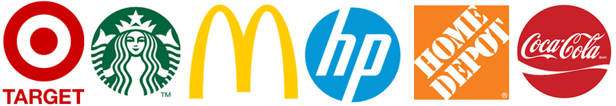
For a strong and memorable brand, starting with 1 to 3 colors is usually recommended. Think of major brands like Coca-Cola, Target, or Starbucks—all of which are identified by a single, dominant color. Too many colors can dilute your brand’s message and make it less recognizable. If you’re just beginning, sticking to a limited color palette helps in creating a clear and focused brand identity.
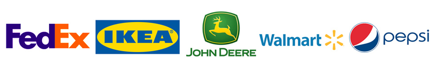
And even the famous two-color contenders: Verizon, Walmart, Pepsi, Ikea, Wells Fargo…you get the drift. It’s not only the mark, font, or art of the logo, but the colors that works for them as well.
 What Colors To Use
Colors can express various emotions and ideas, so understanding their associations can guide your choices. Here’s a quick rundown of what different colors typically represent:
- Red: Passion, energy, excitement, and attention. It’s a powerful color that demands notice. However, depending on what it’s paired with, it can also seem angry.
- Yellow: Warmth, happiness, and caution. It’s bright and cheerful but can also be used to signal warning.
- Brown: Earthiness, reliability, and comfort. Often seen in natural or traditional contexts.
- Purple: Creativity, luxury, and sophistication. It’s an unconventional choice that suggests a high level of originality.
- Orange: Friendly, playful, and enthusiastic. It’s an inviting color that radiates warmth.
- Light Blue: Trust, tranquility, and openness. Ideal for conveying calm and reliability.
- Dark Blue: Authority, security, and professionalism. It’s often used in technology and finance.
- White: Cleanliness, simplicity, and modernity. It’s versatile and can suggest purity or minimalism.
- Silver/Gray: Modernity, neutrality, and professionalism. It’s a sophisticated choice that can be seen as corporate.
- Green: Health, freshness, and stability. It’s associated with growth and nature.
- Black: Power, elegance, and sophistication. It’s a classic choice that can be very bold.
- Pink: Femininity, playfulness, and warmth. It’s often associated with youth and sweetness.
- Gold: Wealth, prestige, and glamour. It’s a rich, opulent choice that suggests success.
Gather Inspiration
To narrow down your choices, start by creating a mood board on Pinterest or using tools like Adobe Color CC or ColorKuler. Collect images and color schemes that resonate with the vibe you want for your brand. As you gather inspiration, you’ll likely see patterns in the colors you’re drawn to. This process helps in honing in on a palette that feels right for your brand’s identity.
From your collection, select 3 to 6 colors that you’re excited about. These initial choices are just a starting point. You’ll refine and adjust your palette as you proceed, using the color wheel to explore combinations.
How Colors Work Together
Not to get too color-techy, but for those who didn’t have art class at some point in school, this is how the color wheel rolls, so to speak. There are three different types of color combinations I recommend choosing from: Complementary, Analogous (or harmonious), and Monochromatic.
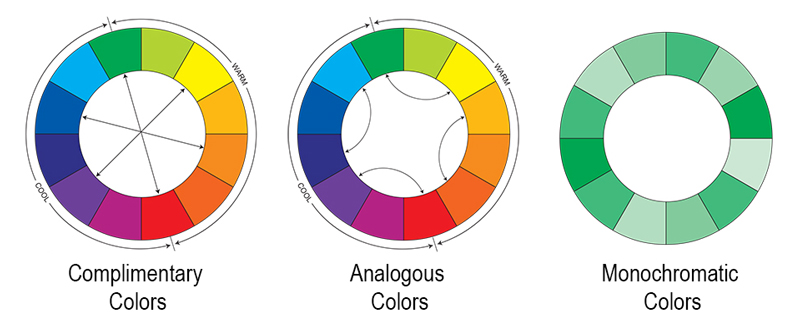
- Complementary Colors: These are opposite each other on the color wheel, like blue and orange. This pairing creates a vibrant contrast that stands out and captures attention. It’s great for making a bold statement.
- Analogous Colors: These colors sit next to each other on the wheel, such as blue, teal, and green. They blend well and create a harmonious, soothing effect. This scheme is safer and ensures a cohesive look but might not be as striking.
- Monochromatic Colors: This scheme involves variations of a single color by adding white, black, or gray. It’s a minimalist approach that emphasizes the depth and range of one color. However, it can sometimes look monotonous if not varied enough.
Choose the color scheme that best aligns with your brand’s direction and message. Adjust as needed until you find a combination that feels just right.
Remember, there are no strict rules when it comes to branding colors. Trust your instincts and the psychological impact of the colors you choose. Balancing personal preference with color psychology will help you develop a brand identity that’s both unique and effective.
Until next time…stay inspired!
Sue Colao / Owner, Purple Fish Creative


